
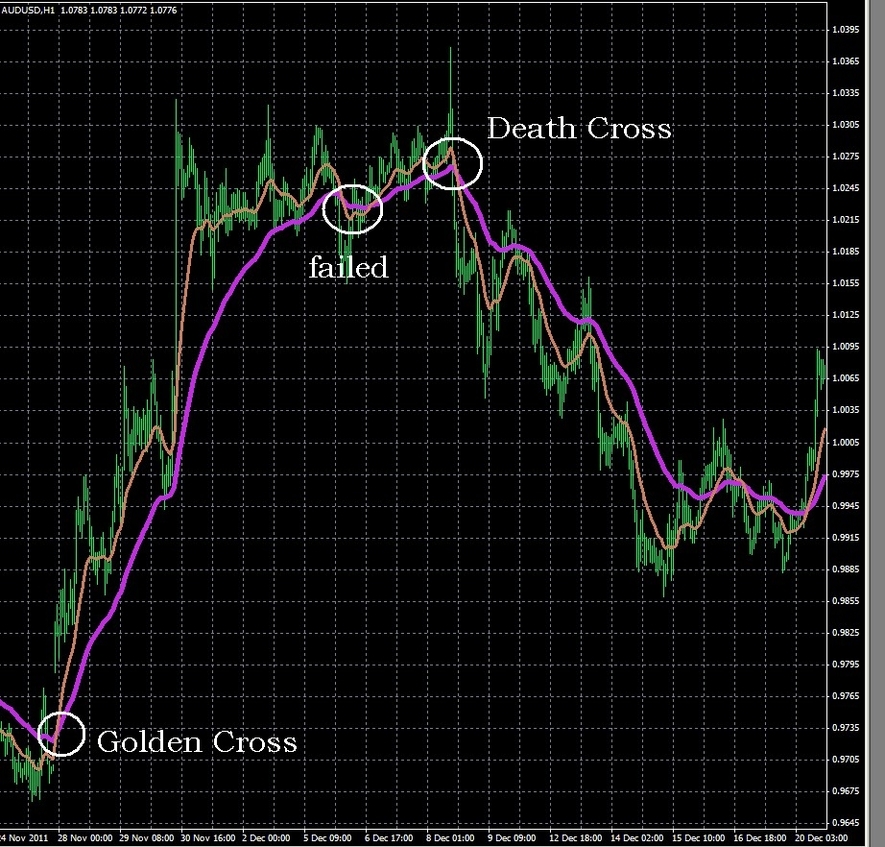
The Death Cross: An Overview
The “Death Cross” is a technical analysis chart pattern that signals a potential market downturn. It occurs when a security’s short-term moving average, typically the 50-day, crosses below its long-term moving average, usually the 200-day. This pattern reflects recent price weakness and is often seen as a bearish (negative) indicator.
Understanding the Death Cross
The Death Cross is named for its X-like graphical representation, where the short-term moving average descends or “crosses” below the long-term moving average. This pattern is widely followed by traders and analysts as an indicator of potential market shifts.
ignificance of the Death Cross
Despite its ominous name, the Death Cross is not necessarily a harbinger of disastrous market events. It merely indicates that recent price action has deteriorated over a period slightly longer than two months. Those who believe in the pattern’s predictive power note that the Death Cross preceded all severe bear markets of the past century, including those of 1929, 1938, 1974, and 2008. However, this view can be subject to sample selection bias, as it overlooks many instances where the Death Cross was followed by nothing more severe than a market correction.
Performance After the Death Cross
Historically, the Death Cross has been followed by above-average short-term returns. For instance, since 1971, the 22 instances in which the 50-day moving average of the Nasdaq Composite index fell below its 200-day moving average were followed by average returns of about 2.6% over the next month, 7.2% in three months, and 12.4% six months after the Death Cross.
The Death Cross vs. The Golden Cross
The Death Cross’s counterpart is the Golden Cross, which
