
Chronic disease graphs are visual representations of data related to chronic diseases. They can depict various aspects such as the prevalence, incidence, risk factors, and trends of chronic diseases. These graphs are crucial tools for understanding the impact of chronic diseases on populations and evaluating the effectiveness of public health interventions.
Data Sources
Chronic disease graphs are typically based on data collected through surveillance systems. For instance, the Public Health Agency of Canada’s Canadian Chronic Disease Indicators (CCDI) and the CDCs National Center for Chronic Disease Prevention and Health Promotion (NCCDPHP) in the United States provide data on chronic diseases.
Types of Chronic Disease Graphs
1. Prevalence Graphs: These graphs show the proportion of a population that has a specific chronic disease at a given time. They can help identify the burden of a disease in a population.
2. Incidence Graphs: These graphs depict the number of new cases of a chronic disease in a population over a specific period. They are useful for understanding the rate at which a disease is spreading.
3. Risk Factor Graphs: These graphs illustrate the prevalence of risk factors associated with chronic diseases, such as smoking, obesity, and physical inactivity. They can inform strategies for disease prevention.
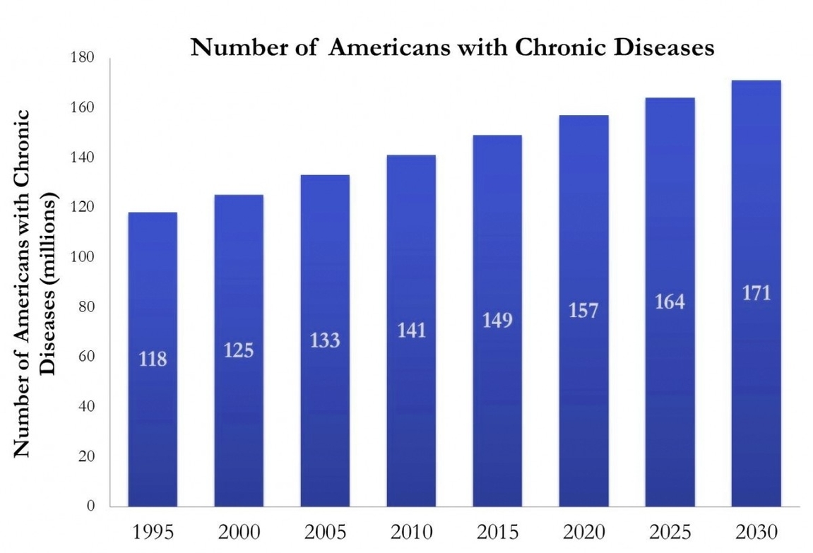
4. Trend Graphs: These graphs display changes in disease prevalence, incidence, or risk factors over time. They can reveal patterns and help predict future disease burdens.
Applications of Chronic Disease Graphs
Chronic disease graphs are used by public health officials, researchers, policymakers, and healthcare providers for various purposes:
1. Surveillance: Chronic disease graphs enable the monitoring of disease trends over time, helping to identify emerging health issues and evaluate the impact of public health interventions.
2. Policy Development: These graphs can inform the development of policies aimed at preventing and managing chronic diseases.
3. Resource Allocation: By highlighting the burden of different diseases, these graphs can guide the allocation of healthcare resources.
4. Public Awareness: Chronic disease graphs can raise public awareness about the prevalence and risks of chronic diseases, encouraging preventive behaviors.
Challenges and Limitations
While chronic disease graphs are valuable tools, they also have limitations. The accuracy of these graphs depends on the quality and completeness of the underlying data. Incomplete or inaccurate data can lead to misleading graphs. Additionally, these graphs typically represent population-level data and may not reflect individual experiences or disparities within populations.
In conclusion, chronic disease graphs are powerful tools for understanding, monitoring, and responding to chronic diseases. They transform complex data into visual formats that can inform public health strategies, policy development, and resource allocation. However, it’s crucial to consider the quality of the underlying data and the potential for disparities within the represented populations.